ROLLING STONE FEATURE SPREADS
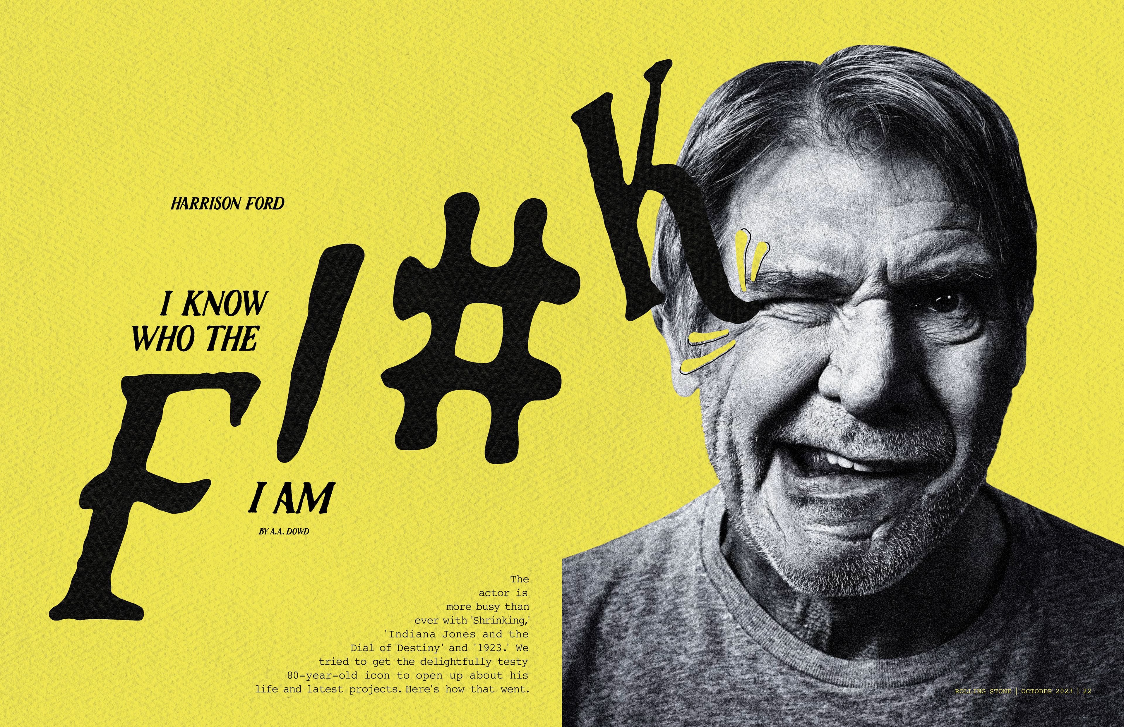
Publication design project for Rolling Stone magazine. The purpose of this project was to use provided photography to create a conceptual design for two feature spreads. Below is my first option for a feature spread, in which my goal was to use type in an intriguing way to draw attention to the feature spreads. In this first feature spread, my goal was to make the type look like it's running up and kicking Ford in the side of the face since the provided photography looked like he was wincing or flinching. I felt that the action of the type kicking him matched the energy of the title "I Know Who the F!#K I Am". I was aiming for a punchy, confident, and bold feel.
STUDENT PROJECT
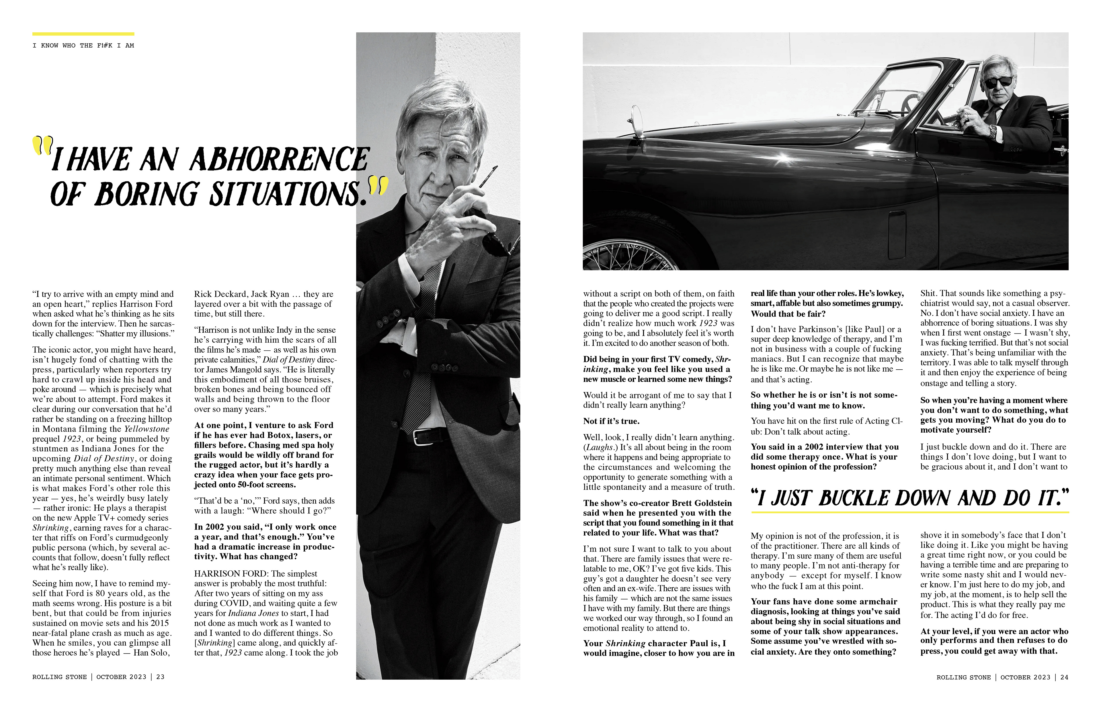
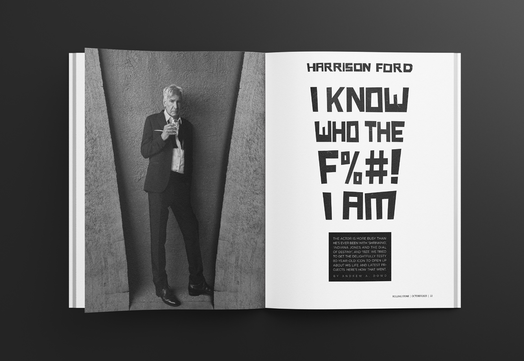
Below is my second option for a feature spread. I listened to the provided photography and found that the angle of the wall in the photo mimicked the shape of an exclamation point. The original photo only had one of those angles, though, so I used photoshop to mirror that angle to create the exclamation point shape on both sides. I also wanted to create a sense of boldness with the type on the right page and have it reflect the image on the left.